[Seaborn] 4. violin plot
seaborn 바이올린 플롯
사용할 데이터
from sqlalchemy import create_engine
import numpy as np
import pandas as pd

n = 300

data = {
    '국어': np.round(np.random.normal(75, 10, size=n).clip(50, 100), 1),
    '영어': np.round(np.random.normal(72, 12, size=n).clip(50, 100), 1),
    '수학': np.round(np.random.normal(70, 15, size=n).clip(50, 100), 1),
    '성별': np.random.choice(['남', '여'], size=n),
    '반': np.random.choice([f'{i}반' for i in range(1,10)], size=n)
}

df = pd.DataFrame(data)
1. 기본 박스플롯
plt.figure(figsize=(12, 6))
sns.boxplot(
    data=df, x='반', y='국어',
)- data에 데이터프레임, x,y에 컬럼 각각 삽입
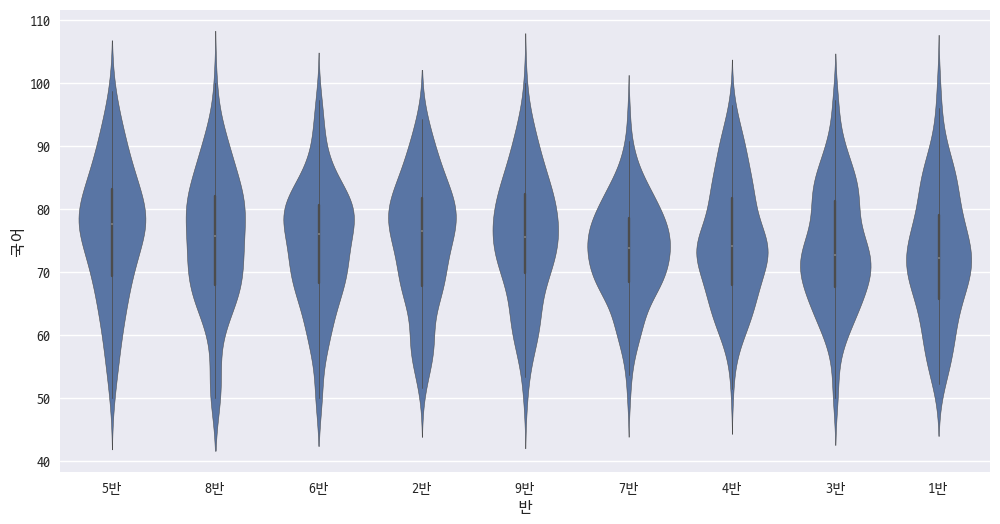
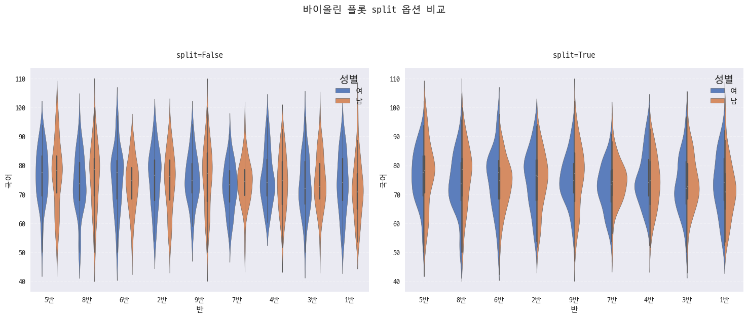
2. 그룹화
fig, ax = plt.subplots(1, 2, figsize=(15, 6))

for i, split in enumerate([False, True]):
    sns.violinplot(
        # 기본 데이터 설정: 데이터프레임 / X축(범주) / Y축(수치)
        data=df, x='반', y='국어',

        # 그룹화 및 스타일링: 색상 구분 / 팔레트 / 채도
        hue='성별', palette='muted', saturation=0.7,
        split=split,
        ax=ax[i]
    )
    ax[i].set_title(f'split={split}', pad=15)
    ax[i].grid(True, axis='y', linestyle='--', alpha=0.3)

plt.suptitle('바이올린 플롯 split 옵션 비교', y=1.05, fontsize=14)
plt.tight_layout()- hue랑 palette는 다른 플롯과 비슷하다.
- 성별같이 2개로 분류되어있는 인자를 hue에 넣고, split 유무에 따라 아래처럼 나뉜다.
- False로 설정하면 개별 분포를, True로 설정하면 x마다 hue를 보여준다.
- 어짜피 대칭이라서 split True가 더 깔끔한듯
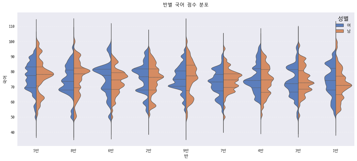
3. 바이올린 스타일링
plt.figure(figsize=(15, 6))

sns.violinplot(
    # 기본 데이터 설정: 데이터프레임 / X축(범주) / Y축(수치)
    data=df, x='반', y='국어',

    # 그룹화 및 스타일링: 색상 구분 / 팔레트 / 채도 / 분할
    hue='성별', palette='muted', saturation=0.7, split=True,

    # 내부 표시 설정: box, quartile, point, stick, None
    inner='quartile',

    # 바이올린 모양 설정: 너비 / 선두께 / 밀도정규화
    width=1, linewidth=1, density_norm='area',

    # 커널 밀도 추정 설정: 대역폭 방식 / 대역폭 조정 / 꼬리 길이(sigma)
    bw_method='scott', bw_adjust=0.3, cut=10
)

plt.title('반별 국어 점수 분포', pad=15)
plt.grid(True, axis='y', linestyle='--', alpha=0.3)- inner에 어떤 것을 넣을지 설정할 수 있다.
- box는 boxplot넣는건데, 범주가 많아서 박스가 제대로 보이지 않는다. 그냥 박스플롯을 그리자
- quartile을 넣으면 사분위수를 넣을 수 있다.
- point, stick을 넣으면 분포를 point, stick으로 채우는데, 사용할 경우 플롯이 너무 난잡해진다.
- 커널밀도를 추정해서 분포를 확인할 수 있다.
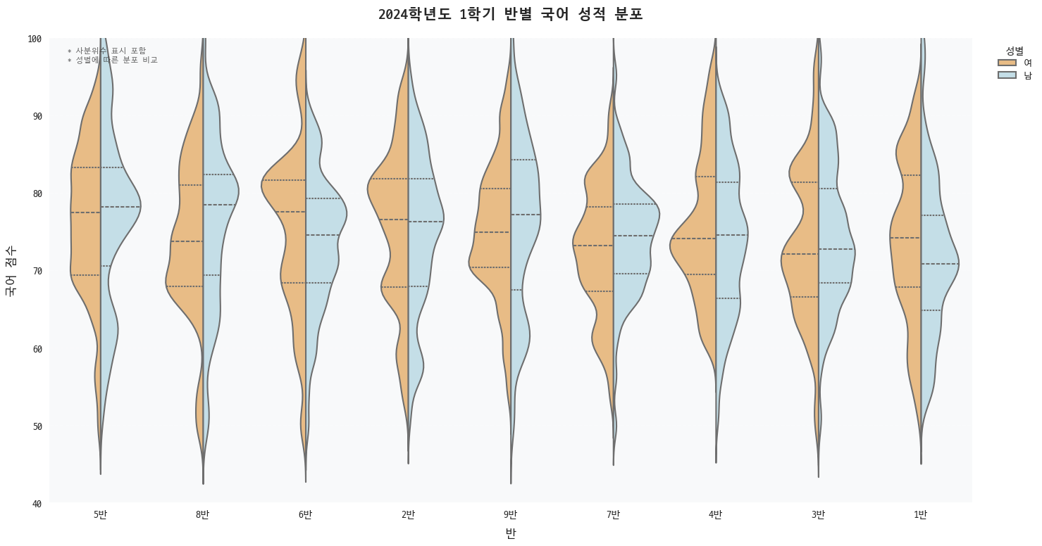
4. 상세 커스터마이징
# 스타일 설정
plt.style.use('seaborn-v0_8')
plt.rcParams["font.family"] = "D2coding"

plt.figure(figsize=(15, 8))

# 바이올린 플롯
sns.violinplot(
    # 기본 데이터 설정
    data=df, x='반', y='국어',

    # 그룹화 및 스타일링
    hue='성별',
    palette='RdYlBu',  # 빨강-노랑-파랑 색상 구성
    saturation=0.7,
    split=True,

    # 내부 표시 설정
    inner='quartile',  # 사분위수 표시

    # 바이올린 모양 설정
    width=0.9,
    linewidth=1.5,
    density_norm='area',
    cut=3,

    # 커널 밀도 추정 설정
    bw_method='scott',
    bw_adjust=0.5  # 더 세밀한 디테일
)

# 제목 설정
plt.title('2024학년도 1학기 반별 국어 성적 분포',
         pad=20,
         fontsize=15,
         fontweight='bold')

# 축 레이블 설정
plt.xlabel('반', fontsize=12, labelpad=10)
plt.ylabel('국어 점수', fontsize=12, labelpad=10)

# 격자 설정
plt.grid(axis='y', linestyle='--', alpha=0.3)

# y축 범위 설정
plt.ylim(40, 100)

# 범례 설정
plt.legend(
    title='성별',
    title_fontsize=10,
    fontsize=9,
    bbox_to_anchor=(1.02, 1),
    loc='upper left'
)

# 배경 스타일링
plt.gca().set_facecolor('#f8f9fa')  # 연한 회색 배경
plt.grid(True, axis='y', linestyle='--', alpha=0.3)

# 테두리 제거
sns.despine(left=False, bottom=False)

# 여백 조정
plt.tight_layout()

# 주석 추가 (선택사항)
plt.text(0.02, 0.98,
         '* 사분위수 표시 포함\n* 성별에 따른 분포 비교',
         transform=plt.gca().transAxes,
         fontsize=8,
         va='top',
         alpha=0.7)
정리
sns.violinplot(
    # 기본 데이터 설정: 데이터프레임 / X축(범주) / Y축(수치)
    data=df, x='col1', y='col2',

    # 그룹화 및 스타일링: 색상 구분 / 팔레트 / 채도 / 분할
    hue='col3', palette='muted', saturation=0.7, split=True,

    # 내부 표시 설정: box, quartile, point, stick, None
    inner='quartile',

    # 바이올린 모양 설정: 너비 / 선두께 / 밀도정규화 / 꼬리 길이
    width=1, linewidth=1, density_norm='area', cut=2,

    # 커널 밀도 추정 설정: 대역폭 방식 / 대역폭 조정
    bw_method='scott', bw_adjust=0.3
)- 스니펫으로 설정해서 불러올 수 있게 설정하면 끝
{
    "Seaborn Violinplot Template": {
        "prefix": "sns_violin",
        "body": [
            "sns.violinplot(",
            "    # 기본 데이터 설정: 데이터프레임 / X축(범주) / Y축(수치)",
            "    data=${1:df}, x='${2:col1}', y='${3:col2}',",
            "",
            "    # 그룹화 및 스타일링: 색상 구분 / 팔레트 / 채도 / 분할",
            "    hue='${4:col3}', palette='${5:muted}', saturation=${6:0.7}, split=${7:True},",
            "",
            "    # 내부 표시 설정: box, quartile, point, stick, None",
            "    inner='${8:quartile}',",
            "",
            "    # 바이올린 모양 설정: 너비 / 선두께 / 밀도정규화 / 꼬리 길이",
            "    width=${9:1}, linewidth=${10:1}, density_norm='${11:area}', cut=${12:2},",
            "",
            "    # 커널 밀도 추정 설정: 대역폭 방식 / 대역폭 조정",
            "    bw_method='${13:scott}', bw_adjust=${14:0.3}",
            ")"
        ],
        "description": "Create a Seaborn violinplot with common parameters"
    }
}'Data Visualization > Seaborn' 카테고리의 다른 글
| [Seaborn] 8. pairplot (0) | 2024.11.15 |
|---|---|
| [Seaborn] 7. jointplot (0) | 2024.11.15 |
| [Seaborn] 6. heatmap (0) | 2024.11.15 |
| [Seaborn] 5. barplot (0) | 2024.11.15 |
| [Seaborn] 3. boxplot (0) | 2024.11.15 |
| [Seaborn] 2. histplot (0) | 2024.11.15 |
| [Seaborn] 1. scatterplot (0) | 2024.11.14 |


댓글