[Seaborn] 13. pointplot
사용할 데이터
import pandas as pd
import numpy as np
import seaborn as sns
import matplotlib.pyplot as plt
# 데이터 생성
np.random.seed(42)
months = ['3월', '4월', '5월', '6월', '7월']
classes = ['A반', 'B반', 'C반', 'D반']
# 각 반별 기본 성적 수준 설정
base_scores = {
'A반': 80, 'B반': 95, 'C반': 65, 'D반': 75
}
data = []
for class_name in classes:
base = base_scores[class_name]
for month in months:
# 각 반/월마다 30명의 학생 점수 생성
for student in range(30):
trend = months.index(month) * 2 # 시간에 따른 변화
noise = np.random.normal(0, 5) # 개인차
score = base + trend + noise
data.append({
'월': month,
'반': class_name,
'점수': round(min(100, max(0, score)), 1) # 0~100 범위 제한
})
# DataFrame 생성
df = pd.DataFrame(data)
1. pointplot 기본
sns.pointplot(data=df)
2. 컬럼 입력
sns.pointplot(data=df, x='월', y='평균점수')
- 오차막대가 생김
3. 그룹화
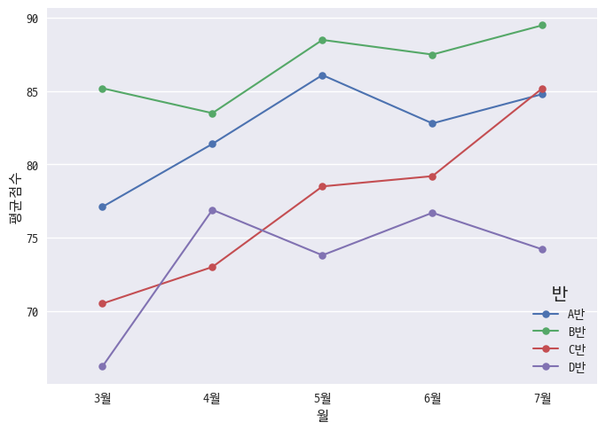
sns.pointplot(data=df, x='월', y='평균점수', hue='반')
4. 선 및 마커 스타일
sns.pointplot(
# 기본 데이터 설정: 데이터프레임 / X축 / Y축 / 색상구분
data=df, x='월', y='평균점수', hue='반',
# 마커 설정: 종류 / 크기
markers='o', markersize=5,
# 선 설정: 스타일 / 두께
linestyles='-', linewidth=1.5)
5. 오차막대 사용
plt.figure(figsize=(10, 6))
sns.pointplot(
# 기본 데이터 설정: 데이터프레임 / X축 / Y축 / 색상구분
data=df, x='월', y='점수', hue='반',
# 스타일 설정: 팔레트 / 투명도
palette='muted', alpha=0.8,
# 마커와 선 설정: 마커종류 / 선스타일 / 마커크기 / 선두께
markers='o', linestyles='--',
markersize=10, linewidth=1.5,
# 오차막대 설정: 신뢰구간 / 가로선크기
errorbar=('ci', 95), capsize=0.2
)
plt.title('반별 월간 평균 점수 변화', pad=15)
plt.grid(True, alpha=0.3)
정리
# Point Plot
sns.pointplot(
# 기본 데이터 설정: 데이터프레임 / X축 / Y축 / 색상구분
data=df, x='월', y='평균점수', hue='반',
# 스타일 설정: 팔레트 / 투명도
palette='muted', alpha=0.8,
# 마커와 선 설정: 마커종류 / 선스타일 / 마커크기 / 선두께
markers='o', linestyles='-',
markersize=10, linewidth=1.5,
# 오차막대 설정: 신뢰구간 / 가로선크기
errorbar=('ci', 95), capsize=0.2
)
plt.title('Point Plot Title', pad=15)
스니펫
{
"Seaborn Pointplot Template": {
"prefix": "sns_point",
"body": [
"# Point Plot",
"sns.pointplot(",
" # 기본 데이터 설정: 데이터프레임 / X축 / Y축 / 색상구분",
" data=${1:df}, x='${2:col1}', y='${3:col2}', hue='${4:col3}',",
"",
" # 스타일 설정: 팔레트 / 투명도",
" palette='${5:muted}', alpha=${6:0.8},",
"",
" # 마커와 선 설정: 마커종류 / 선스타일 / 마커크기 / 선두께",
" markers='${7:o}', linestyles='${8:-}',",
" markersize=${9:10}, linewidth=${10:1.5},",
"",
" # 오차막대 설정: 신뢰구간 / 가로선크기",
" errorbar=('ci', ${11:95}), capsize=${12:0.2}",
")",
"",
"plt.title('${13:Point Plot Title}', pad=15)"
],
"description": "Create a Seaborn pointplot with common parameters"
}
}
'Data Visualization > Seaborn' 카테고리의 다른 글
[Seaborn] 12. lineplot (0) | 2024.11.15 |
---|---|
[Seaborn] 11. swarmpplot (0) | 2024.11.15 |
[Seaborn] 10. stripplot (0) | 2024.11.15 |
[Seaborn] 9. countplot (0) | 2024.11.15 |
[Seaborn] 8. pairplot (0) | 2024.11.15 |
[Seaborn] 7. jointplot (0) | 2024.11.15 |
[Seaborn] 6. heatmap (0) | 2024.11.15 |
댓글